Watson Discovery v2 — project type selection UI
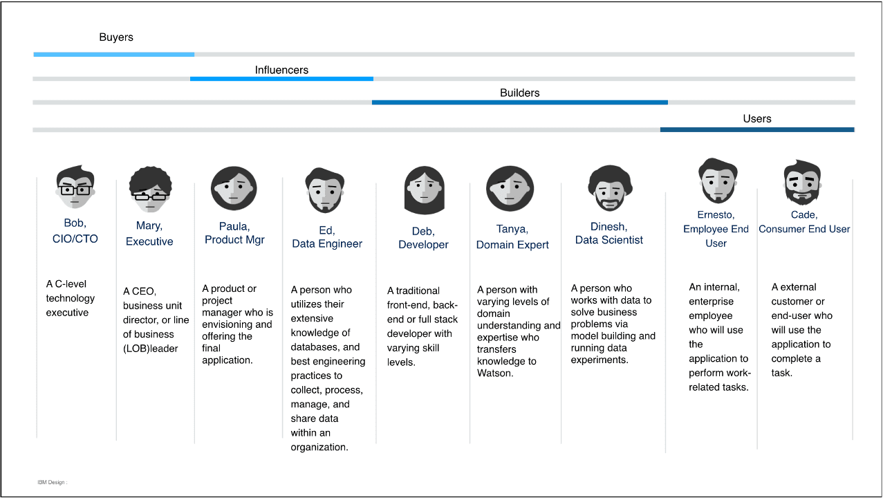
Watson Discovery · IBM · 2019–2020

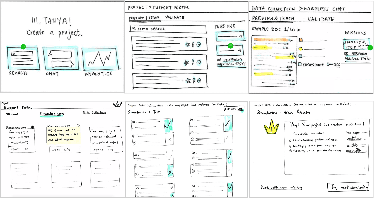
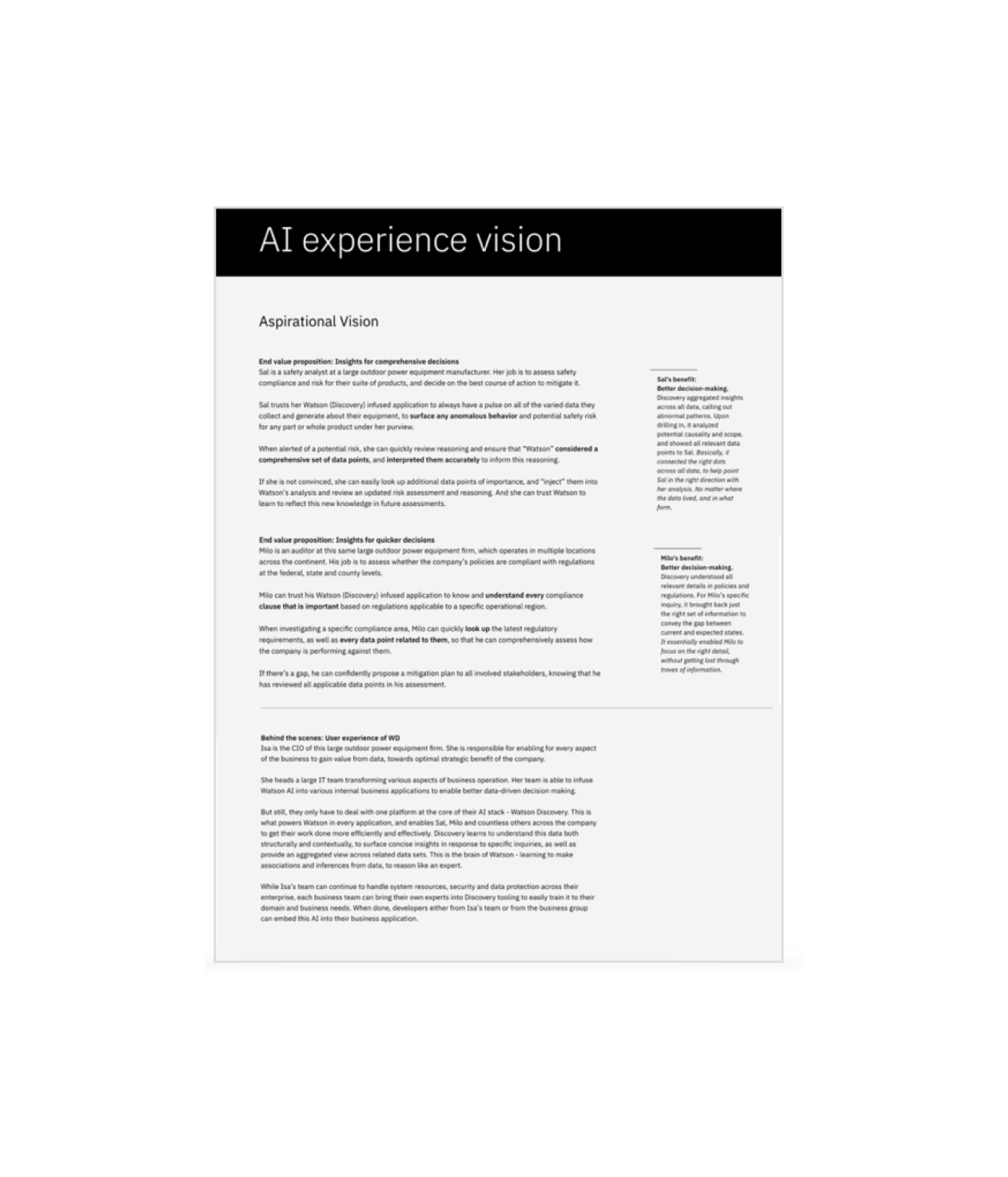
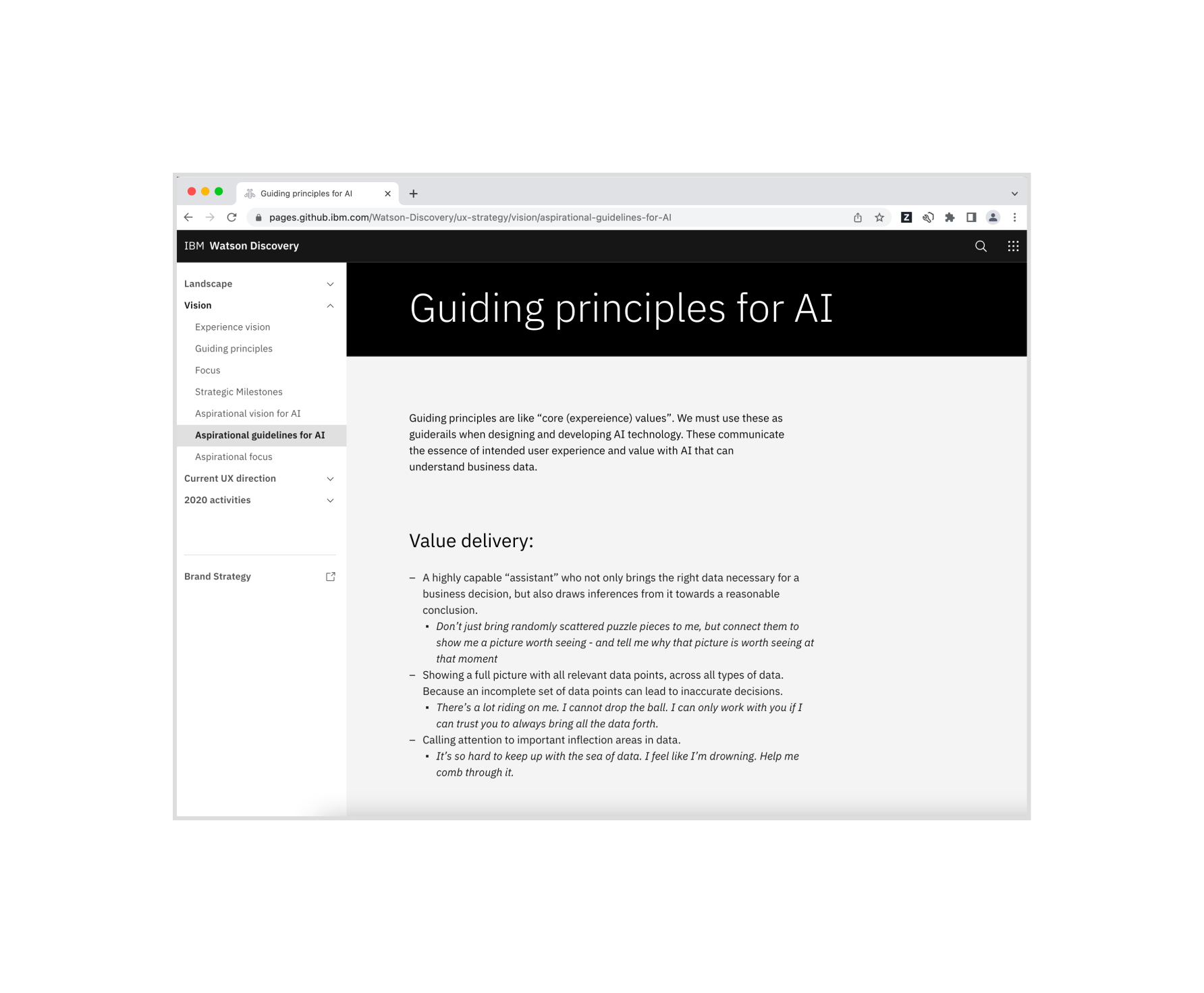
Watson Discovery: Democratizing AI for business users

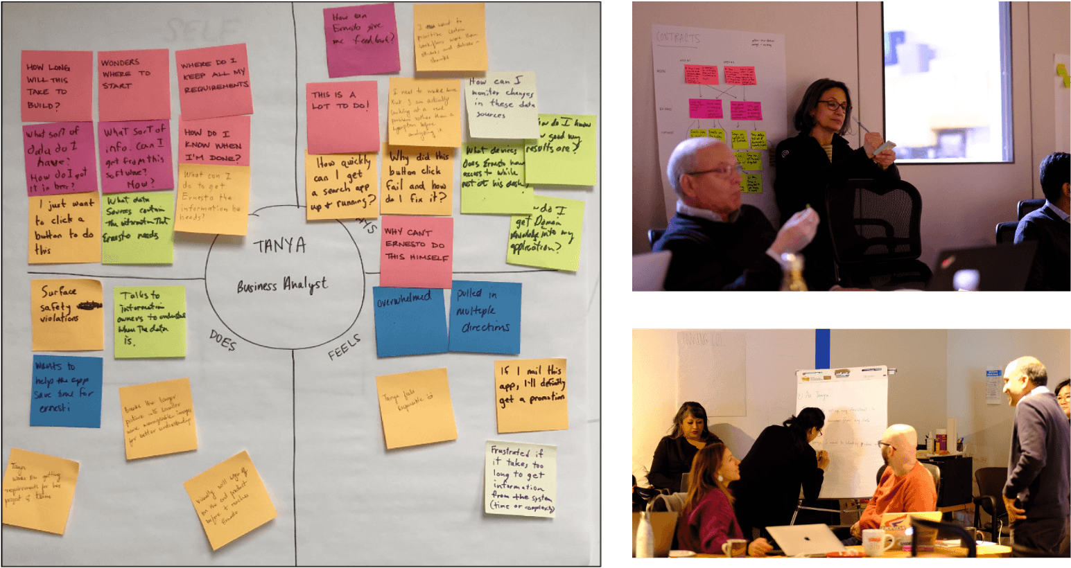
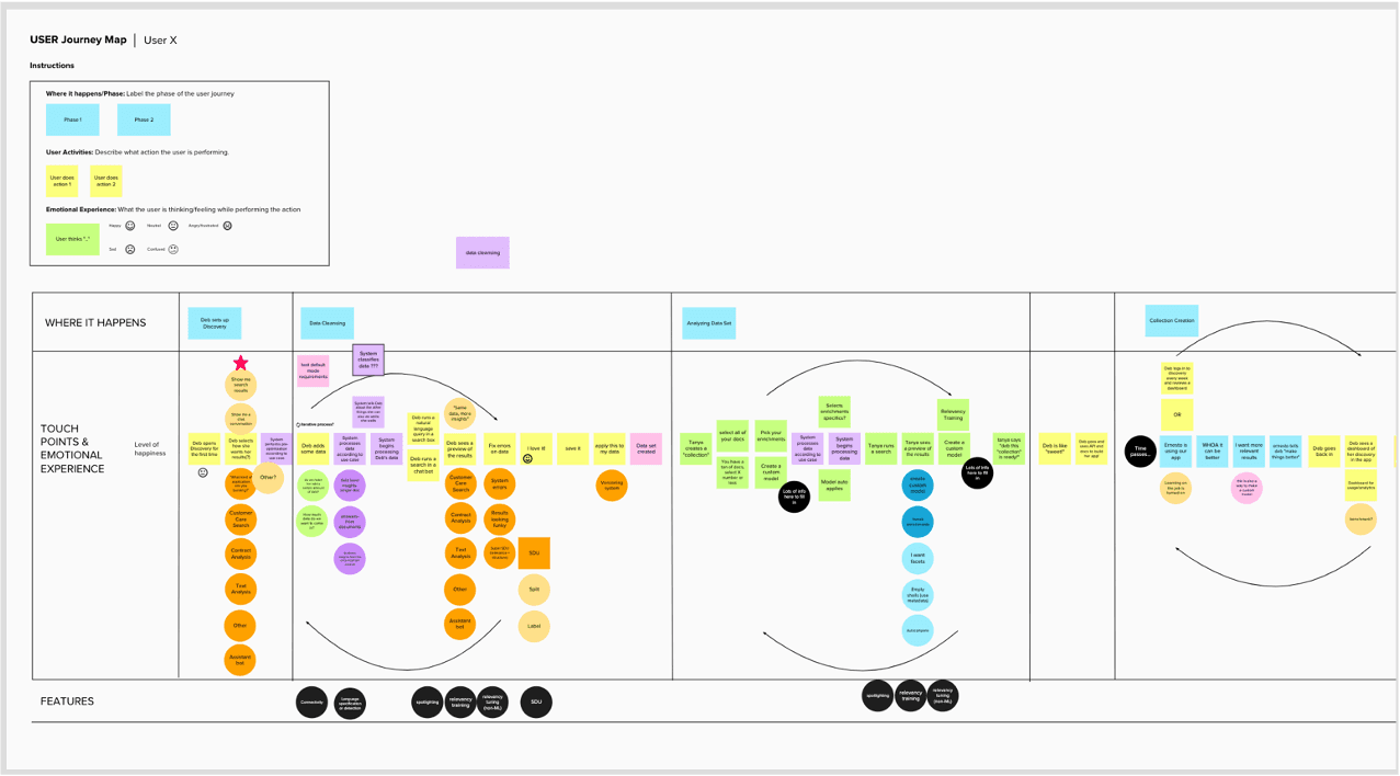
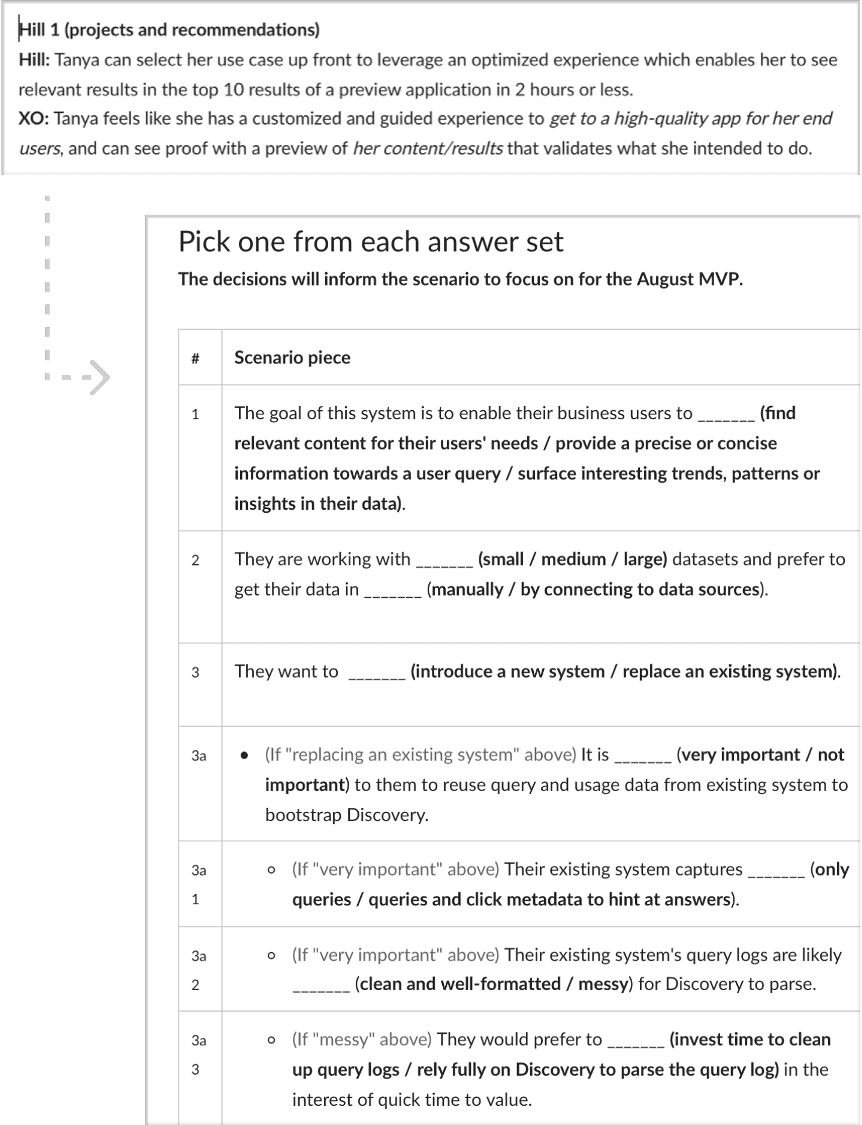
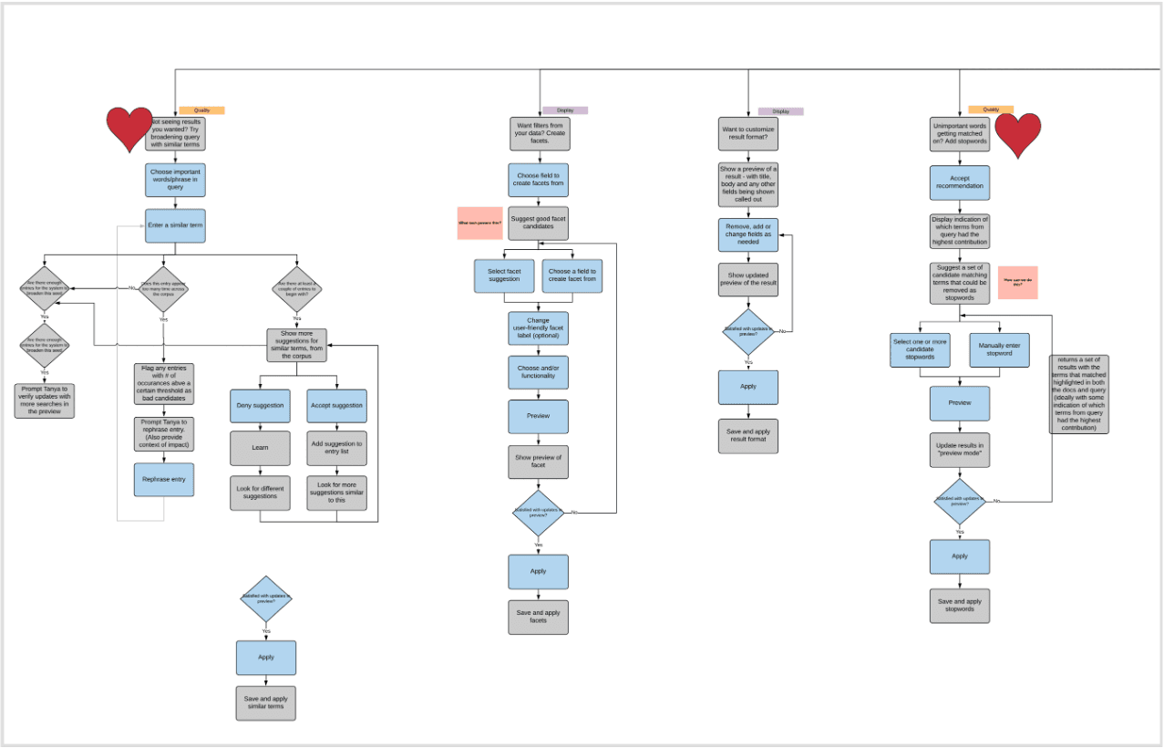
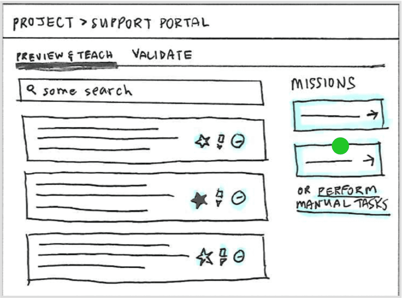
Delivering the MVP of a strategic pivot for an established enterprise AI product — evolving it from a developer tool to a low/no-code platform for citizen builders.

Senior Designer + UX Architect
9 months
FastCo 2020 Innovation By Design Award — Product Design category
150 engineers, 13 PMs, 9 designers. 4 product areas across US & Japan
Jump to
Mission UX Strategy UI Design Outcome
01
Mission

Evolve Watson Discovery into a low/no-code platform for citizen AI builders

Watson Discovery v1 was one of IBM's flagship enterprise AI products — the first GUI to let companies build AI search and analytics on unstructured data. But it was built for AI developers who understood data pipelines, model retraining, and natural language processing.

The v2 mission: reach across the enterprise to business teams who needed AI without requiring coding or AI expertise. The product had to evolve its user base, its mental model, and its entire experience — without losing what made it powerful.

02
UX Strategy

Leading with UX strategy

4 inflection points I drove
01 Who are we actually designing for?
I distilled market and user research to map the full enterprise role ecosystem — identifying which roles had the motivation, scope, and access to become citizen AI builders. This replaced abstract assumptions with a grounded user profile the whole team could design against.
I ran a strategy workshop to bring the cross-functional team face-to-face with this research — resetting the group from a feature-centric mindset to solution experiences for real user problems.
02 How do we unify 4 product areas into one coherent experience?

I led PM, Engineering, and Research across all 4 product areas to collaboratively build a "to-be" journey map for the citizen builder workflow. Every squad could see how their piece fit into the full picture — spotting constraints early and orienting delivery around a shared goal instead of individual feature backlogs.

03 Where should the team focus its innovation?

I paired closely with PMs to translate the journey map into IBM hills & epics, then defined 2 hero moments as concrete innovation targets — giving every squad clarity on what "great" looked like and preventing delivery from fragmenting into isolated features across 150 engineers.

04 What are we building toward beyond the MVP?

I defined an aspirational AI experience vision — grounded in business opportunity, the user landscape, and Watson's technical capabilities — that kept long-term coherence intact across releases, so short-term delivery decisions never lost sight of the end-state.

2 hero moments that focused delivery

With 150 engineers across 4 product areas, there were infinite ways to innovate. These two hero moments gave every squad a concrete innovation target — keeping the experience coherent and delivery from fragmenting into isolated features.

Hero Moment 01

A guided approach to iteratively improve AI training accuracy — making the feedback loop visible and actionable for non-experts.

Hero Moment 02

An easy way to get started with minimal effort to reach the first moment of value — dramatically lowering the barrier to entry for citizen builders.

03
UI Design

Key design focus areas

Projects turned a developer configuration tool into an outcome-driven experience. Choosing a project type helped users think about the end goal they were trying to achieve — and the product met them there, with recommendations and previews, instead of a wall of settings.

From low-fi concept to validated final design

Success of the Projects concept depended on how well we mapped projects and outcomes to various configuration flows in Watson Discovery. I collaborated closely with engineering to map this through system flowcharts, acceptance criteria, API reviews, and test cases.

Validating terminology through usability testing

Given how foundational this concept was to the redesign, the design team ran multiple rounds of validation with users. The concept resonated — but users' mental model of the configuration steps was unclear. We iterated heavily on terminology until the UI copy was unambiguous.

Usability test synthesis — terminology testing
Usability test synthesis — terminology iteration Research
Final validated UI copy and configuration labels
Final validated configuration UI Final UI

Few-shot NLP training productized as a builder-friendly workflow. The core challenge: powerful research capability, but only valuable if users understood what it did and why it mattered — and could act on it without AI expertise.

Domain vocabulary training — high fidelity final UI
Domain vocabulary training — final UI Final UI

Fitting research innovation into user workflow

I explored various ways to productize this asset from the Research organization. While the technical innovation was strong, fitting it into a user's workflow — so it would provide measurable value — was the critical design challenge.

Early exploration — domain vocabulary training placement in workflow
Early explorations — fitting vocabulary training into the builder workflow Low-fi exploration
Domain vocabulary training UI — final design
Early explorations — fitting vocabulary training into the builder workflow Low-fi exploration
Vocabulary suggestions and acceptance flow
Early explorations — fitting vocabulary training into the builder workflow Low-fi exploration

Designing for suggestion quality and ease of acceptance

I collaborated with Research team to explore various contextual ways to seed the NLP model through natural touch points across a user's workflow. We wanted to reduce the burden of another extra task for the user as much as possible. Ease of accepting, rejecting and revising terms was important both from a UX perspective and for technical reasons - critical for building confidence.

Suggestion quality and term management UI
Term suggestion management — accept, reject, and revise Mid-fi exploration
↳ Note

The 5-term threshold was a technical constraint we designed around. Making this invisible to the user while keeping the experience feel effortless was the core UX challenge.

Final vocabulary training UI with full term management
Final vocabulary training — complete term management view Design spec
Vocabulary training integrated in product context
Vocabulary training in product context Design spec

Exploring future extension — auto-identifying domain terms

These interaction design explorations look at how the capability could be extended further — moving beyond manual term entry by auto-identifying domain-specific terms directly from documents. This would reduce human effort substantially while preserving user control: surfacing suggested terms in context so builders can review, accept, or dismiss with confidence rather than starting from scratch.

↳ Design considerations

Key open questions the explorations had to address:

  • Term frequency: How should the system behave when a candidate term appears across most documents — surfacing it everywhere risks noise, suppressing it risks missing genuine domain language.
  • Cognitive load: Inline suggestions must inform without overwhelming — the interaction had to feel like a nudge, not an interruption to the reading flow.
  • Scale and annotation density: Long documents with many auto-identified terms create both a system performance challenge and a user friction problem — bulk dismiss or scope controls become essential, not optional.
04
Outcome

Acclaimed for innovation, experience, and design-led transformation

Watson Discovery v2 shipped as a genuinely transformed product — not just a UI refresh, but a fundamental rethinking of who enterprise AI tools are built for.

The pivot to citizen builders was validated in the market: business teams now able to build AI apps without developer expertise, reaching a new user group that v1 had never served. The product was recognized externally as an example of design-led innovation at enterprise scale — FastCo 2020 Innovation By Design Award.

The work aligned 150 engineers, 13 PMs, and 9 designers across 4 product areas in the US and Japan around a single coherent experience — delivered in 9 months.

Reflection

What made this work

The scale of this project meant that alignment artifacts carried as much weight as the UI itself. The to-be journey map and the hills framework weren't just strategy tools — they were the shared language the team used to make decisions for nine months.

Leading with user research to identify the new user group before touching any UI meant we avoided the most common failure mode for enterprise product pivots: building for imaginary users. The usability testing on terminology was a reminder that even well-conceived concepts can fail on language alone.

Next project
Atlas AI — Agentic platform for industrial AI